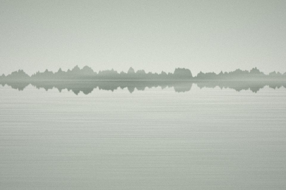
There is a moment in every edit when a picture looks almost right and the colour seems to be the reason it isn’t. The usual fix is to adjust white balance until it looks good. I did that for years, and my series looked like collections of individually good frames that didn’t quite belong together.
What changed it was a simple rule: one white balance per morning.
Why per morning
Light on a given morning has a character. In Still Water, the fog on some days was faintly green, on others neutral grey, on a few warm where the sun came through. When I corrected every frame to neutral, those differences disappeared and every morning looked the same. When I corrected every frame to whatever looked best in isolation, the series lost its consistency and began to look arbitrary.
Setting one white balance for all the frames from a single session preserves what was particular about that morning, while keeping the frames within it consistent with each other. Differences between mornings stay visible, which is honest; differences within a morning disappear, which they mostly should, because they are usually just the camera guessing.
How I pick it
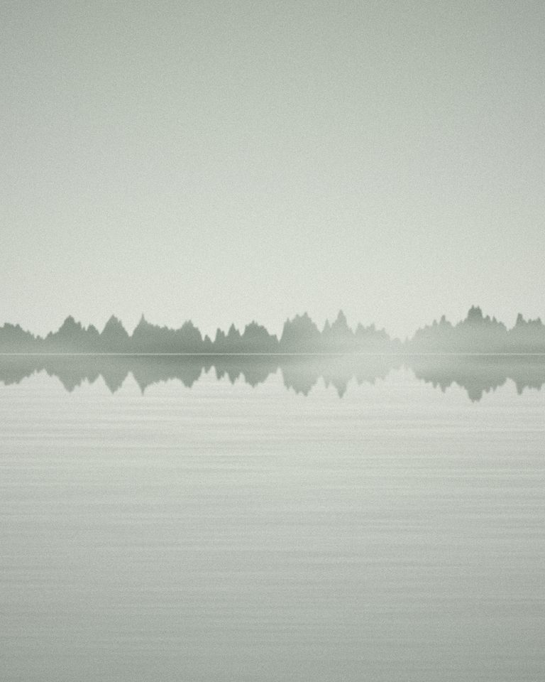
I don’t use a grey card for this kind of work; the “correct” neutral is rarely the point. Instead I choose one frame from the morning that feels most like how I remember it, adjust that one until it matches the memory, and apply the setting to everything else from the session. Then I look at the whole morning as a set and make one small adjustment if something is badly off.
Memory is unreliable, of course. But it is unreliable in a consistent way, and the notes I write in the field — “grey, slight green near the reeds”, “warmer than yesterday” — help keep it honest.
Restraint elsewhere
The same idea applies to saturation. Fog pictures in particular are easy to over-cook: a little extra saturation turns a quiet grey-green into something closer to a postcard. My rule is to leave saturation where the camera put it and adjust only vibrance, and only if the print looks dead.
I also avoid colour grading in the sense of shifting shadows and highlights toward different hues. It can be beautiful, and I enjoy it in other people’s work. For my own series it tends to add a signature that sits on top of the place rather than coming from it.
The goal is to make the colour of the series feel inevitable, not chosen.
Printing
All of this matters most at the print stage. A small colour shift that is invisible on a screen becomes obvious when two prints hang next to each other on a wall. Once a series is sequenced, I print a test strip of every frame on the same sheet, and that sheet is where the final colour decisions happen. Usually one or two frames get nudged. Rarely more.
It is a modest way of working, and it removes a lot of decisions. That turned out to be the point: fewer choices about colour left more attention for the pictures themselves.