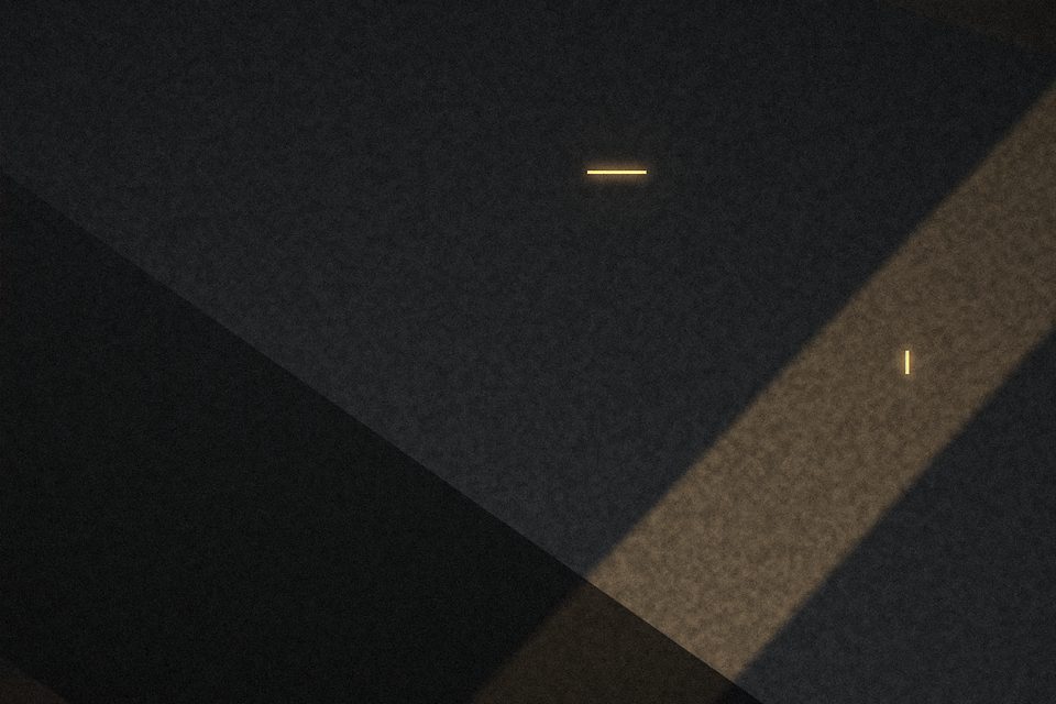
When I started photographing at night, I treated noise as a defect. Every file from Concrete Hours went through noise reduction first, before anything else, because the high-ISO speckle looked like a failure of technique. The results were clean and smooth and, looking back, oddly lifeless — like photographs of models of buildings rather than buildings.
At some point I switched the noise reduction off on a few frames to compare, and the ones without it looked better. Not technically better: the shadows were rougher, the fine lines of the concrete less crisp. But they looked like night. The texture gave the dark areas something to hold, instead of the flat, plastic black that heavy noise reduction leaves behind.
Grain and noise are different things
It is worth being careful with words here. Digital noise at high ISO has two parts: luminance noise, which is variation in brightness from pixel to pixel, and colour noise, which is variation in hue. The second is almost always ugly — blotches of magenta and green in the shadows that nobody has ever wanted. The first is much closer to what film grain looked like, and in moderation it can be pleasant.
So I now treat them separately. Colour noise gets removed, fairly firmly, on every file. Luminance noise gets left alone, or reduced only slightly, and only if it is distracting at the size I intend to print.

When I still reduce it
There are a few situations where I do reach for luminance noise reduction:
- Large smooth areas — a plain sky, a painted wall — where the grain draws attention to itself instead of describing a surface.
- Files that have been lifted by more than a stop in editing. Noise in underexposed shadows has a coarse, blocky character that doesn’t look like grain at all.
- Small web versions, sometimes. Downsizing a grainy file can produce an odd, crunchy texture, and a light pass before resizing helps.
Adding grain
This is the part that surprises people: on a few frames I have added grain. Not to make them look like film, but to make different exposures in the same series feel consistent. If one picture was made at ISO 800 and the one next to it at ISO 3200, the texture differs noticeably when they hang side by side. A small amount of added grain on the cleaner file evens them out.
I keep it subtle, add it at the very end of editing, and always check at print size. Grain that looks right on a monitor often looks too heavy on paper, because the paper adds its own texture.
A clean file is not the same as a good file. Sometimes the texture is the information.
A practical order of operations
For night work, my edits now go roughly like this: white balance and exposure, colour noise reduction, contrast, local adjustments, then a final look at luminance noise at the intended output size. It is a small change from what I did before, but it moved the decision about texture to the end, where I can see what the picture actually needs.
None of this is a rule. Plenty of photographers I admire make spotless night pictures and they are beautiful. But for a series about how buildings feel after dark, the grain turned out to be part of the subject.